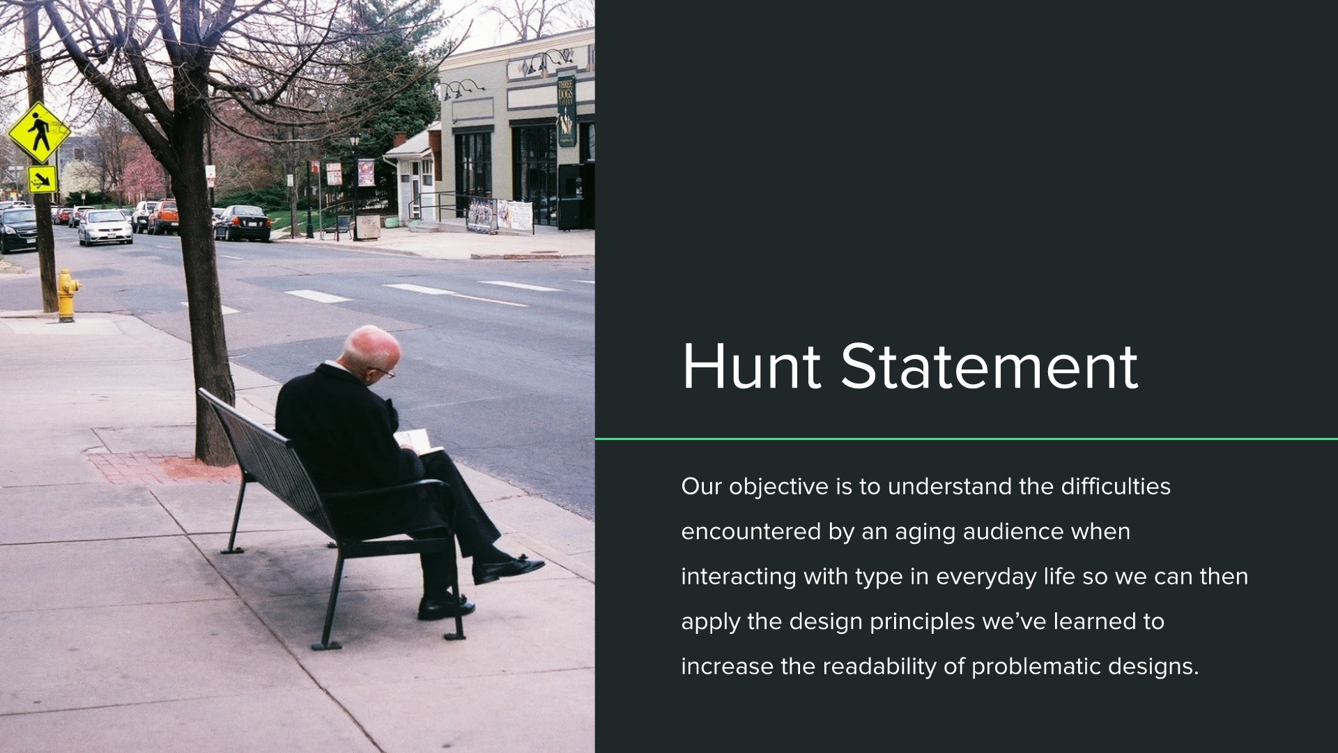
Brief
Redesign an item used by seniors to provide better legibility, readability, and therefore usability.
Concept
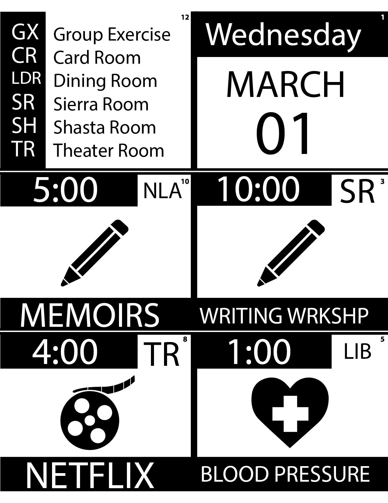
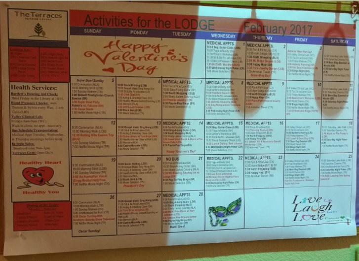
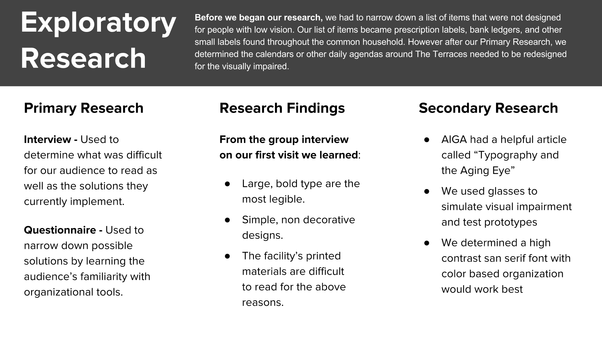
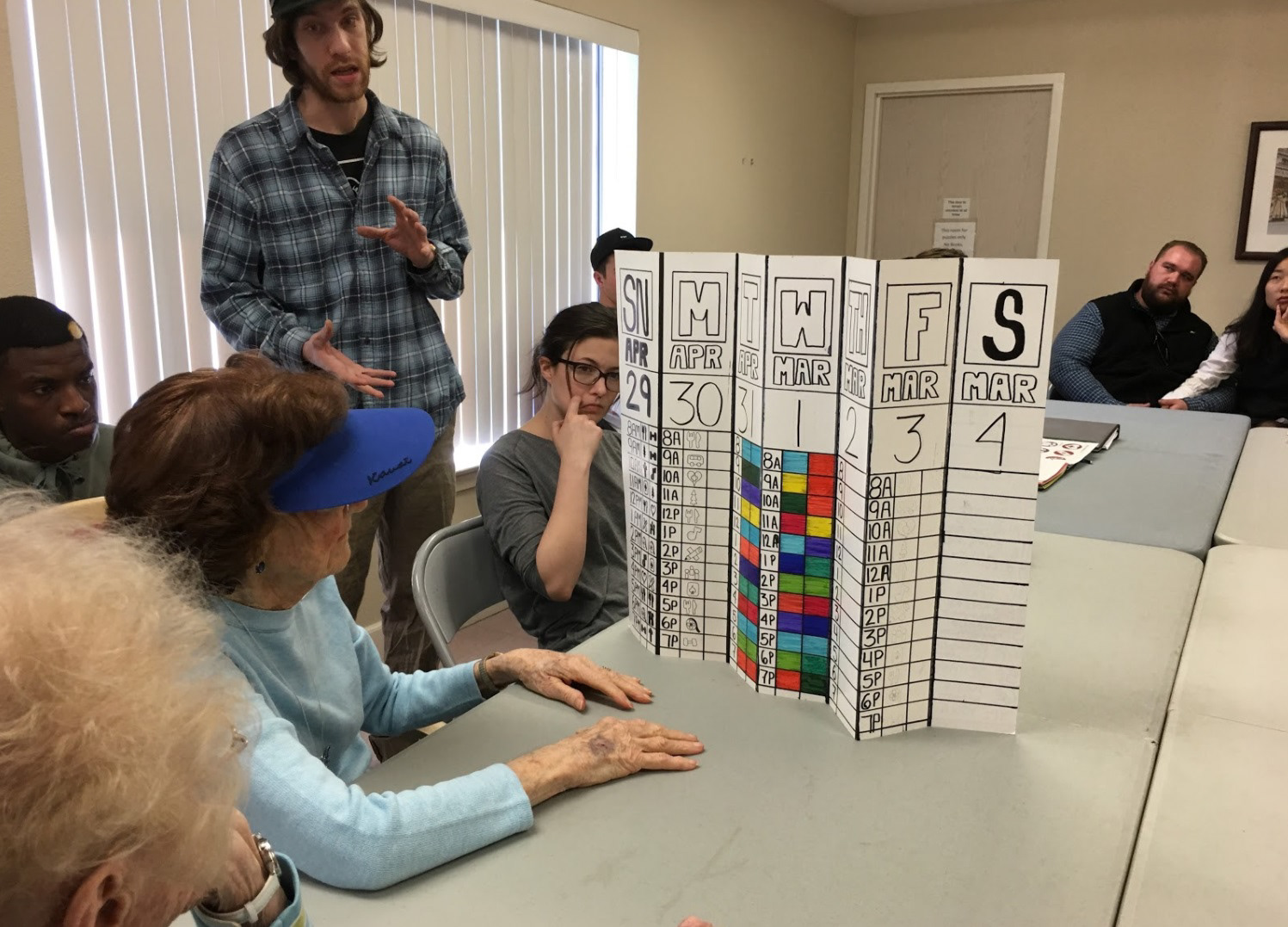
The existing calendar design attempted to convey a month’s worth of information on a single, large page using small type and a color scheme that strained the eyes. In my design process, I attempted to simplify the calendar by providing information by the week using a high contrast color scheme, a large and bold typeface, as well as color coded symbols for each day’s activities.
Prototype
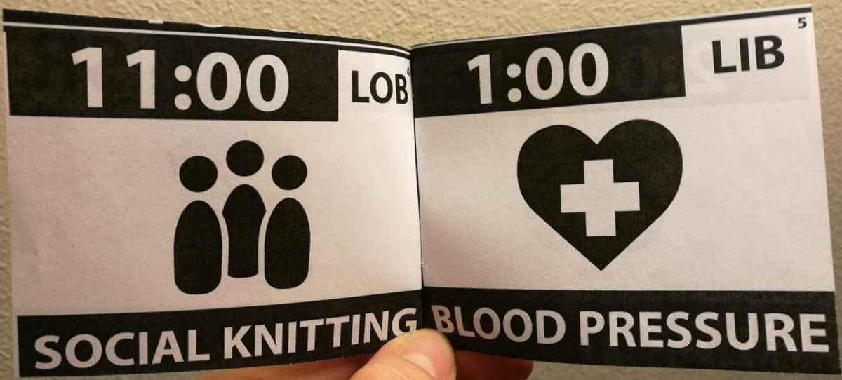
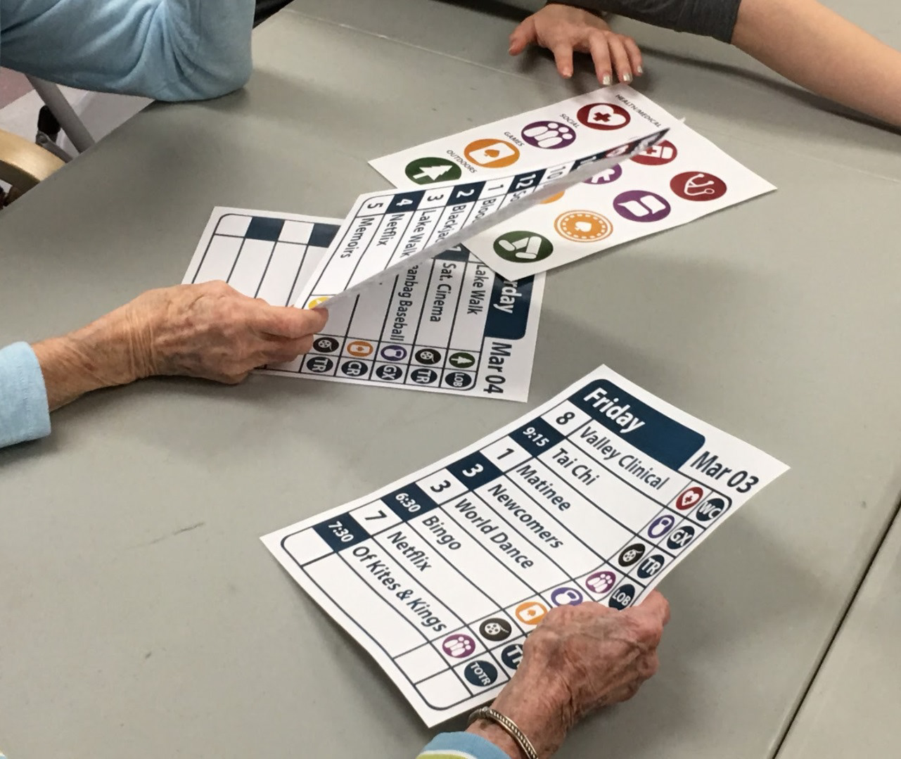
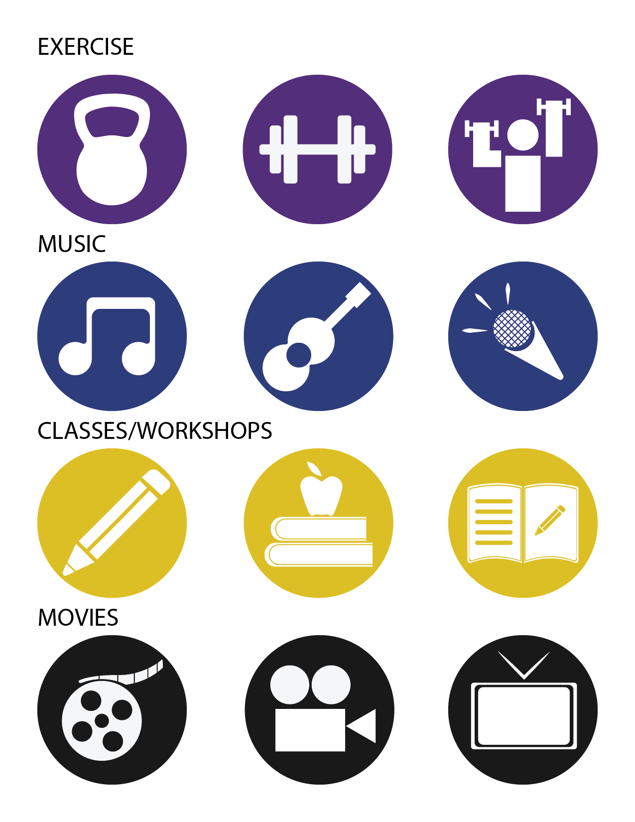
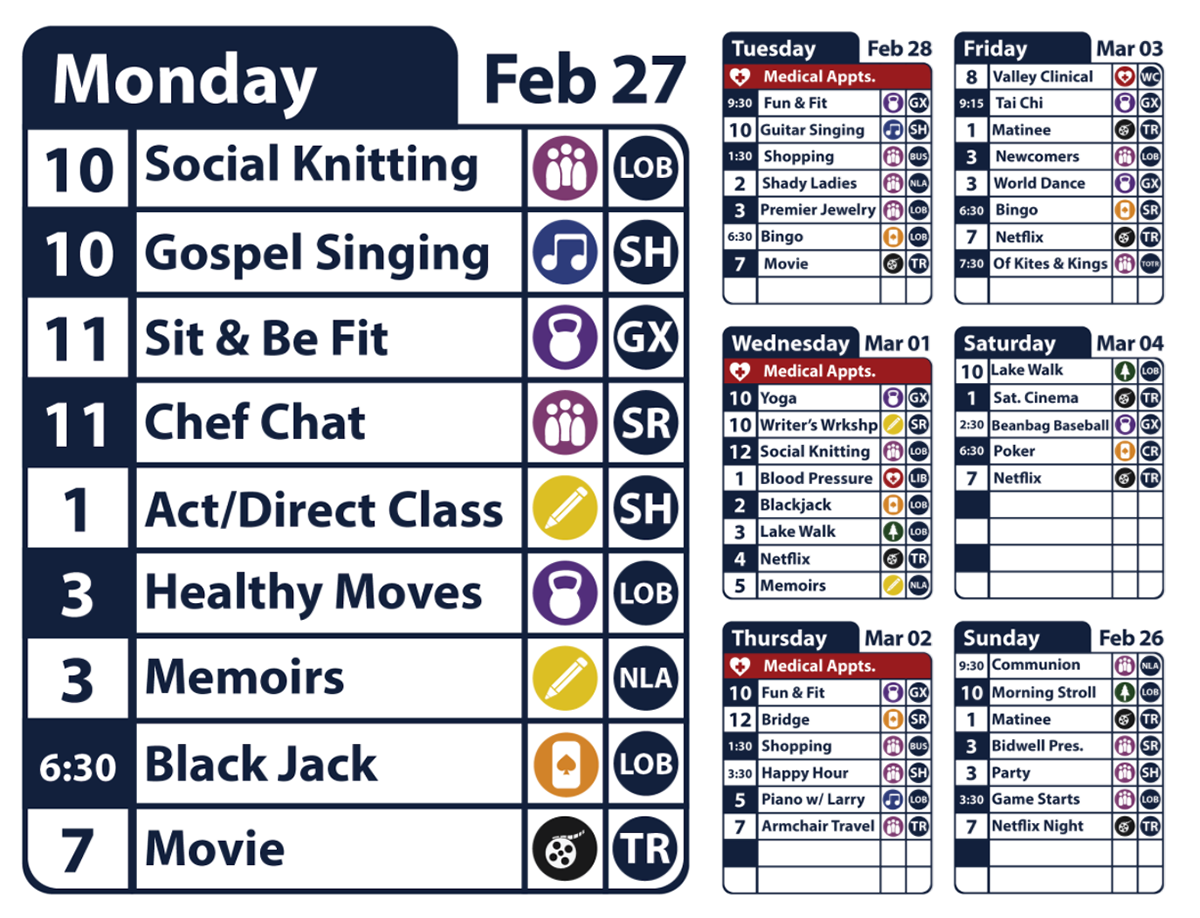
The prototype I developed attempted to be more clear by incorporating a bold san serif typeface paired with color coded symbols to provide more information at a glance. Each day of the week would be scheduled on its own sheet and posted in community areas and bulletin boards.
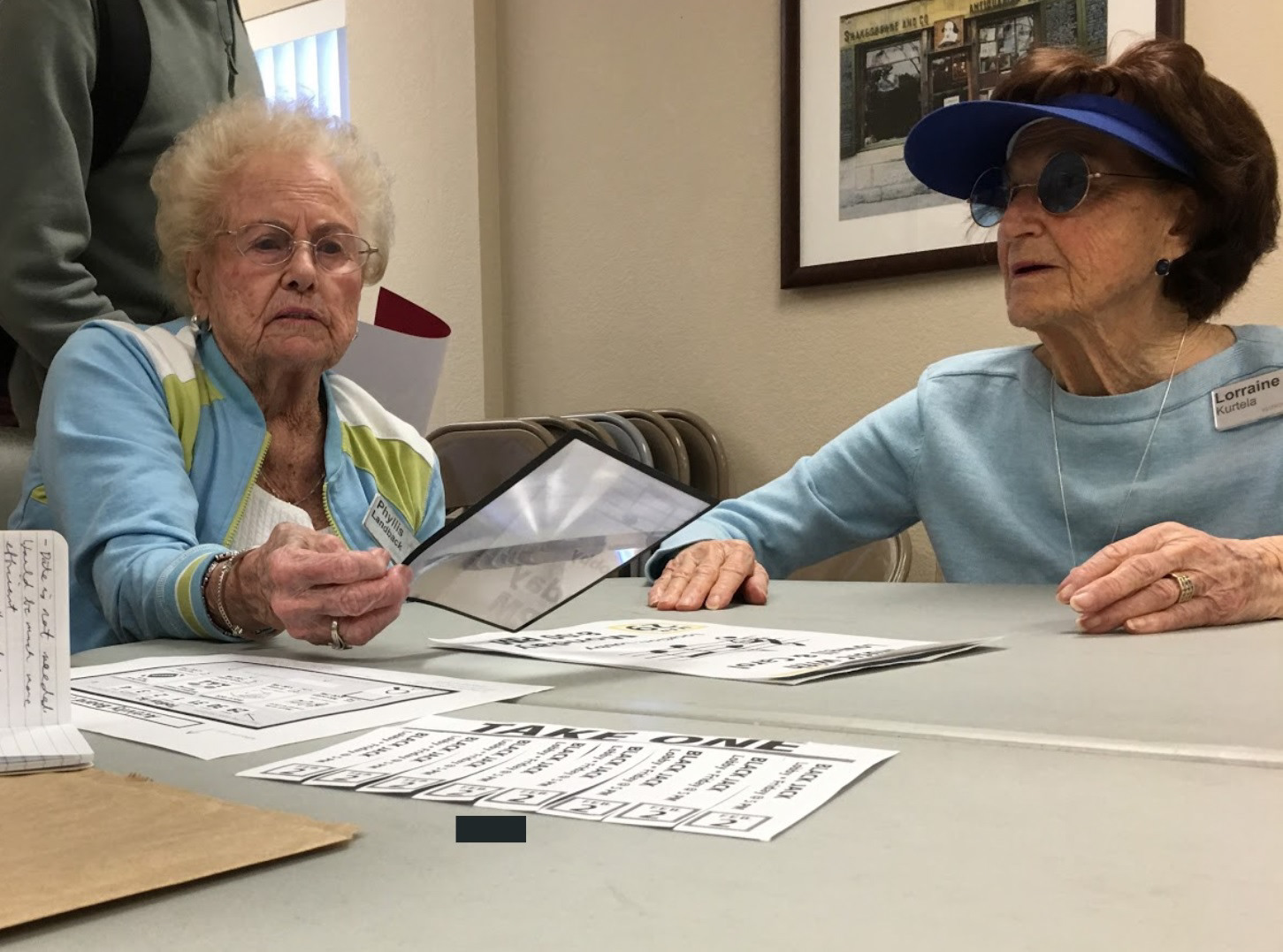
User Testing
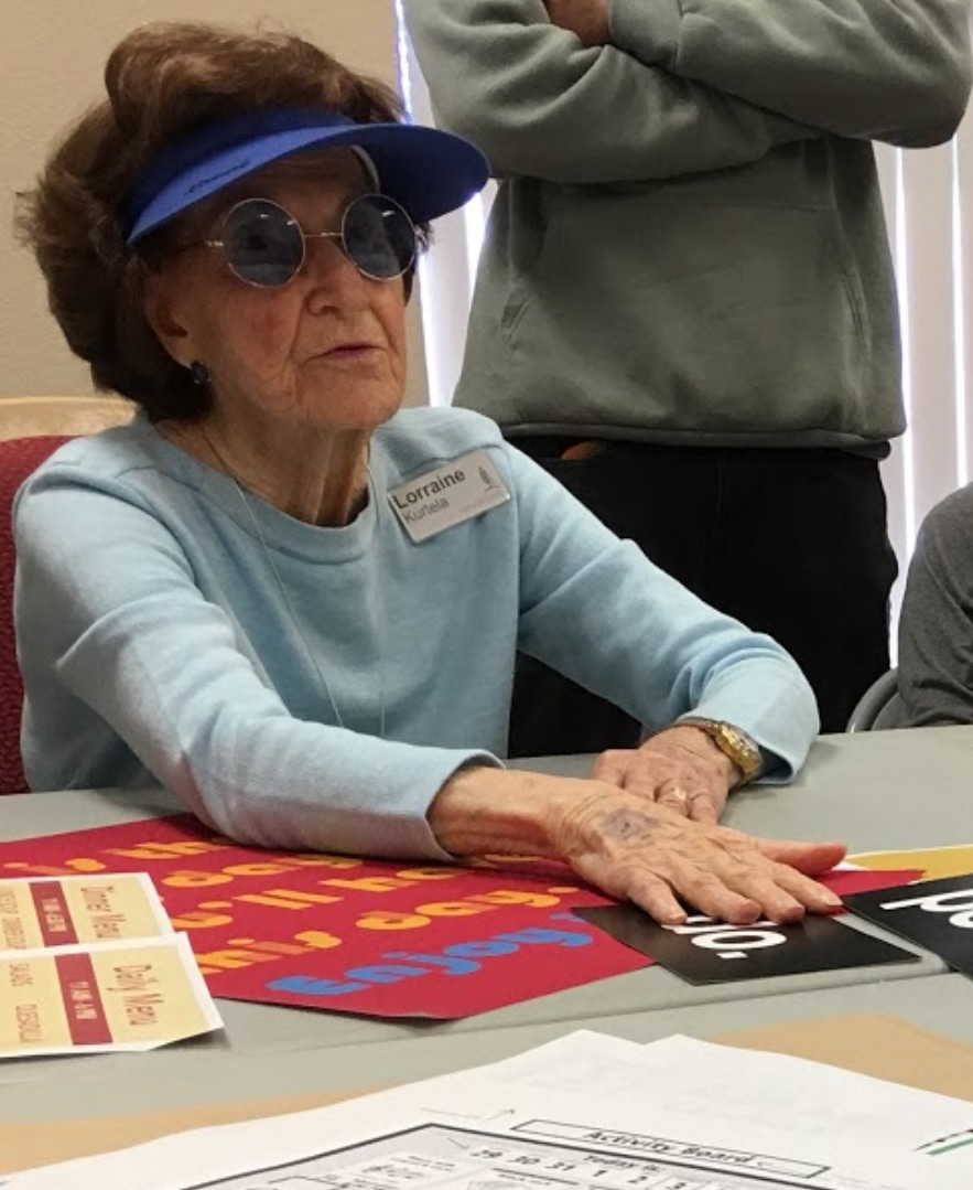
The team of designers working to redesign objects for an aging audience met with a local volunteer group to test initial prototypes and receive feedback. At this meeting I learned that my proposed designs were complex due to the multiple pages and multicolored symbols which were difficult to discern with weakened vision.